- 25 Aug 2022
- 3 Minutes to read
- DarkLight
- PDF
Home
- Updated on 25 Aug 2022
- 3 Minutes to read
- DarkLight
- PDF
Home Dashboard
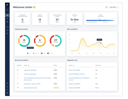
The Home dashboard offers a general overview of the most current cyber activity information for your organization - in graphic format, and dynamically updated for near real-time monitoring. This information is automatically updated every few minutes, but can also be refreshed manually. The dashboard is divided into different segments, each offering detailed or graphic information about the various items.

Here you can:
- Select the time period for the displays (last 30 days, last week, current day).
- Manually refresh the dataset at any time.
- Immediately access and view your incident details (recent or directly assigned) from the display screens via direct linking.
- Return to the Home dashboard from any other window by clicking on its tab from the left side of the CDC platform screen.
The dashboard is automatically refreshed every few minutes, as defined for your organization. Alternatively, you can click the Refresh button from the top right of the dashboard to manually refresh the data.
While in the Home dashboard, you can select the time period to display, found at the top right of the screen.
Information can be displayed for the:
- Current day.
- Last week (7 days).
- Last month (30 days).
Dashboard Incidents and Alert Metrics
High level KPIs about active incidents and alerts are displayed at the top part of the dashboard. This real-time information is continually updated, as it is directly ingested from the various SIEM platforms.
Unhandled Incidents: Lists the number of incidents that have not yet been handled by the L1 SOC analysts, for the selected period.
See also Incident Handling.Unhandled Alerts: Lists the number of alerts that have not yet been handled, for the selected period.
See also Alert Handling.False Positives: Lists the number of false positive alerts during the selected period.
Mean Time to Resolve: Lists the average time it took to resolve an incident or an alert during the selected time period.
These segments also display the percentage of change (increase or decrease) in metrics, based on the same type of previous time period. For example, you could have 14 unhandled alerts for the last 7 days; however, this is displayed with a down arrow of 92%, indicating that there is a 92% reduction of unhandled alerts this past week as opposed to the previous week.
Alerts and Incidents at a Glance
Two different graphs offer analysts immediate representations of the current alert/incident status:
Alerts Trendline: Offers a rough graph of the number of alerts created as time goes by, for the selected time period. This trendline can help detect anomalies.
Incidents by Status and Severity/Priority: These colored bar graphs offer the number of new, closed, and opened incidents according to their severity/priority.
Most Used Tags: Currently Trending Keywords. This segment shows the most prevalent attack types, by the text size and properties (bold, bolder, etc.) of the displayed tags - assuming they are tagged properly - that are trending during the selected time period. Incidents are normally indexed with a descriptive tag. These tags help analysts index all incidents based on the same type of attack.
The bottom two segments offer information collected specifically related to the logged-in CDC platform user/analyst.
Actions assigned to me: As alerts and incidents are being handled and playbook steps adhered to, different actions are allocated to various users. This segment lists your AIs.
My recent incidents: This segment lists all incidents currently being integrated and orchestrated. It enables users to quickly access/view incident details, assisting analysts with a quick response when called upon to confer about an incident - or otherwise, by clicking the link button at the end of each row.

